Monday 26 September 2011

The King's Speech

Watched this film last night for the first time and thought it was brilliant. I'm no film reviewer.. and as any of my friends will tell you I am not the best at celebrity identification.... although I am improving a wee bit! However I just found The King's Speech so well written, shot, presented.. it was great to see such an excellent film without the usual token nude scene, or explosions, or killing. Anyway I'm not going to ramble on about the film...it's great.. that is all. I want to put up some film stills though as I found the imagery beautiful. From Helena Bonham Carter's hats to the scabby wall of the speech therapist's office... just loved it! Lovely muted colours, with some gold trimmings....


Sunday 11 September 2011

Science photography

Some crazy stuff on here.. might come in handy

http://www.sciencephoto.com/

Havana Club- Inspired Ingenuity

'Rum brand Havana Club is challenging people to take everyday objects and turn them into something new, such as a pair of speakers made from Nike trainers, tin can headphones and an ad hoc picnic table
Taking the theme Inspired Ingenuity, the project is supposedly inspired by the people of Cuba who, in the face of the US-imposed blockade on their country have to make a virtue of repurposing and recycling, creating what they need from the scarce resources available.'
source: http://www.creativereview.co.uk/cr-blog/2011/february/inspired-ingenuity


Really like the unusual looks of these pieces, pattern and colour brought in from using existing objects. Non-traditional materials.

Friday 9 September 2011

Nedlaw's Living Walls


' Our living walls break down VOCs, through the process of biofiltration. In controlled laboratory studies, our system removed up to 90% of VOCs in a single pass.  This technology is based upon nature’s inherent ability to repair itself when it is stressed or damaged. Self-rejuvenation is responsible for keeping outside air "fresh". Through careful design, we’ve been able to integrate these cleansing capabilities directly into the building’s air handling system, creating cleaner air flow. An Active Living Wall integrates the beneficial biological processes responsible for cleaning outdoor air thereby offering a sustainable, energy efficient means of controlling indoor contaminants.'
Source: http://www.naturaire.com/

I have always been interested in the utilisation of natural processes within design and think this is not only very clever, functional, but beautiful.

This is Naive


This page of blog is so pretty, a photographic story of the work of Susie Cowie. So much time and effort has gone into making every delicate piece. I really like the illustrative crochet pieces but like the sort of random and unfinished look of this one.


Source: http://thisisnaive.com/?p=2894

Tuesday 6 September 2011

Kareem Iliya

With an impressive list of publications and advertisements using the work of Kareem Iliya, it's easy to see why they want to use the association of elegance and glamour that his illustrations provide. Iliya works in watercolour and inks, the beautiful forms and figures illuminated by a glowing edge, a silhouette effect, or by lines created by an accessory, or forming the shape of a garment.
I think they are completely gorgeous. Sometimes so simple, so elegant, but with such visual impact.


(i had a lot of difficulty only choosing some images...)
All available at http://www.art-dept.com/illustration/iliya/index.html

Friday 2 September 2011

DNA Printing


Found this article on financial times online (and yes this is the first time I have ever ventured to this site... ) called 'Cut from a Different Cloth'
Detailed is what the above image depicts:

Another unique service is available from Cad and the Dandy, a bespoke tailor in London set up by two former bankers. The firm works with DNA Art, a British company which produces a visual representation of client’s DNA from a swab sample of skin cells. A digital photograph of the genetic pattern is made, the client chooses a colour scheme, and Cad and the Dandy print the image on the lining fabric of the customer’s suit jacket. This takes only a month above the eight weeks it takes to have a suit made, but adds £300 to the cost, which otherwise starts at £450. Still, it gives new meaning to the idea of personal style – which, some might say, is priceless.

-whole article, all pretty interesting about new bespoke tailoring for men's design found at http://www.ft.com/cms/s/2/38d869c0-c2a2-11e0-8cc7-00144feabdc0.html#ixzz1WoXFxZs7

I really like this sort of extreme personalisation. Entirely unique design would give more personal value to the object. Find the crossover into science interesting too. 

Jasper James

Love this interiors photgraph by Jasper James, looks super modern, all the geometric reflective surfaces, and really like the colours.. remind me a bit of some of my favourite Cadel paintings.


Also like the layering here. How does a person fit into their environment, how does the environment affect their lives. Think this is something I could give a shot with my Holga lomography camera!


DAIM

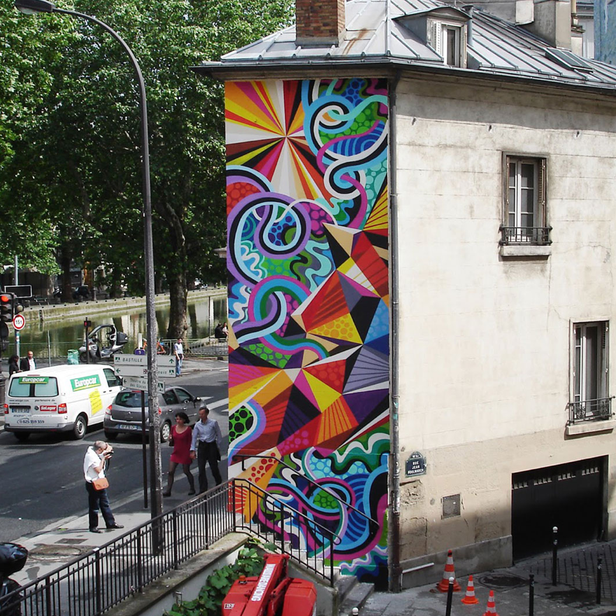
Have loved this artist's work for many years. It is absolutely amazing how he can portray so much 3D space on a 2D surface. Love the architectural quality.
'Form is created by a few lines, colour becomes an emotion, and shapes reminiscient of architectural elements grow and extend into space. Still plains contrast with dynamic elements which divide and cut across the image.
DAIM succeeds in balancing a variety of content and techniques with his individual style. His geometric figures and letters obey the laws of light and shadow but defy gravity and curve space. The beholder is sucked into the image or feels transported to new dimensions.' (http://daim.org/site/en/about/)

Using mostly the letters of his artist's name DAIM- (real name Mirko Reisser) he creates colourful and dynamic works on canvas, and walls of galleries and streets, also taking his work into sculpture.


All available at http://daim.org

Bottom image is a canvas, rest are live public art. really like the combination of textures, both from the surroundings, and from his use of paint textures on the canvas. His use of light and shade is optimal in his work, never using a solid outline as was so common in traditional graffiti writing. All incredible, I could look at his work all day.

The Functionality... again..

PVN- Papervillain
Everyday in London, hundreds of thousands of commuters are handed their own free paper as they approach their local station. They squash onto the tube and attempt to absorb themselves in a world of current affairs and gossip, they arrive at their stop, they exit the station and they deposit their newspaper in the first bin they encounter. This is the new travel novel… but perhaps its life doesn’t need to be so predefined. Perhaps, in reaction to our current throw away society, a better life can be afforded for it…  (http://www.thefunctionality.com/03_pvn/)

Like the repetition of many small units (made hundreds of paper hats and joined them together for this structure), always makes more of an impactand has created a vast textural surface.


Topshop style notes

Like to see what's new on the topshop rails. The turnaround of designs in here is so fast theres endless new things to oogle!
Quite enjoy this little collection:

Especially like the wee eye brooch not sure why it's just so weirdly ornamental!

I love to see some movement in textile prints. This one looks so rich.


Thursday 1 September 2011

I love MWM

Just noticed he even has his own design of Ford Fiesta. and surfboard. and playing cards. and guitars. and raybans. pattern eveeryywheeree! sweet.


MWM graphics


Flipping love these. the bottom one is realllly like the sort of stuff I'd like to do in textiles but I love this one so much I don't know if I can ever live up to it's greatness! Maybe I'll just stop now...

MWM graphics (Matt W. Moore) based in Portland, Maine. Works include canvases, fashion, typefaces, murals... the list seems to be endless. I love the vibrant colours but I think I like the bottom one so much because of it's inclusion of some more toned down colours. I love working with bright accents amongst more subtle tones. The 3D qualities (especially of top image) also really interest me, remind me of my favourite graffiti artist, Daim... maybe there's another post in there.... I actually cant stop raving about this bottom one.. really like the inclusion of some textured panels.
Really looking forward to getting back to some graphic monoprinting, with some illuminants thrown in there... oooh layers. yay.

Wednesday 31 August 2011

Feel It, Take It


A project by the interdisciplinary collective The Functionality: 'Feel It, Take It' combines art and functionality, an installation which on it's decommissioning is pulled apart in to it's individual pieces, (all of which are recylcled felt scarves) and worn by members of the public. As stated on their website: 'Feel It, Take It takes an everyday product sold by street vendors and “hot rods” it into an architectural surface'. It is a striking installation: not often do you hear of felt chandeliers, and it really dominates the space it inhabits. I find this cross over between architecture and functional textiles very interesting.